Client
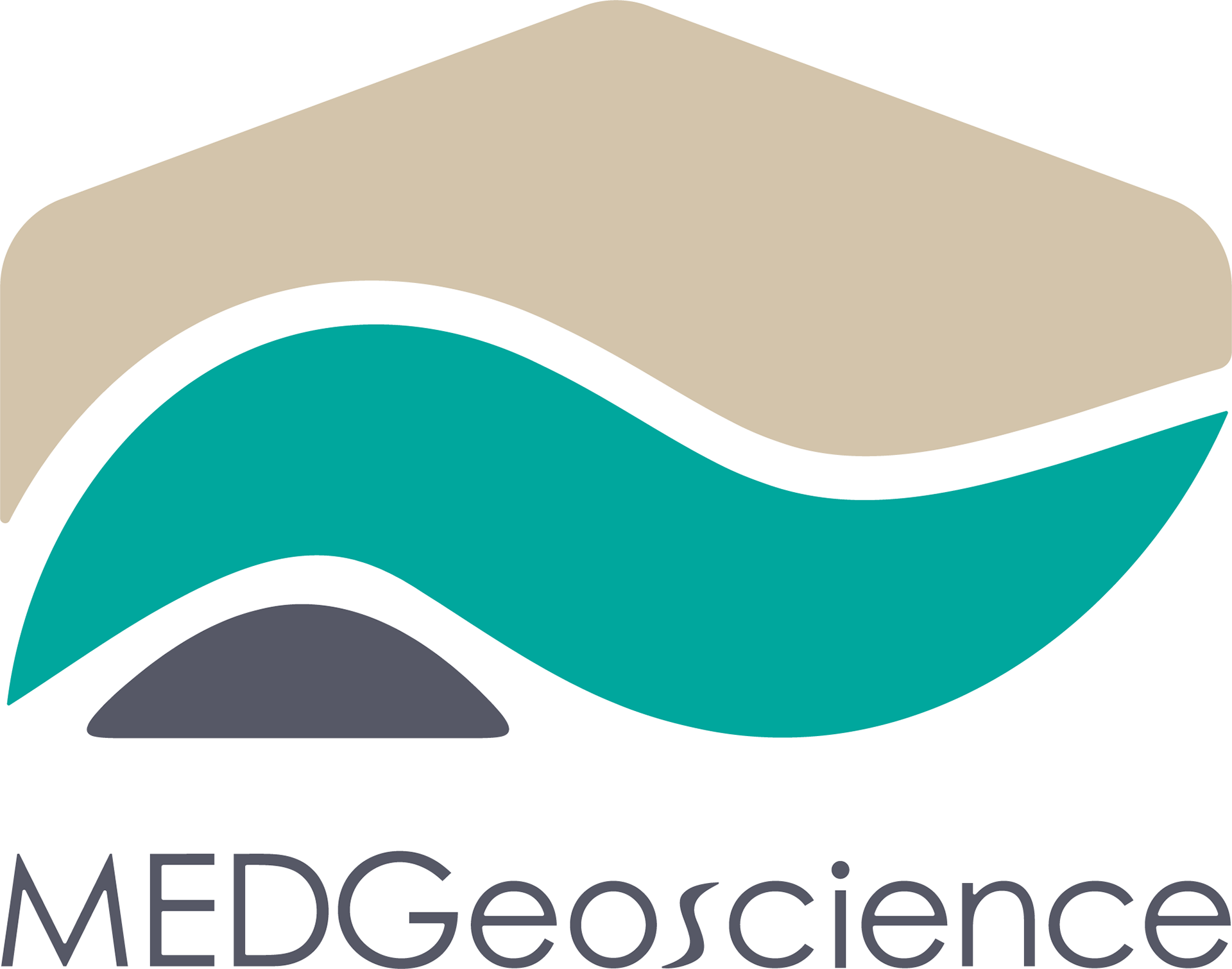
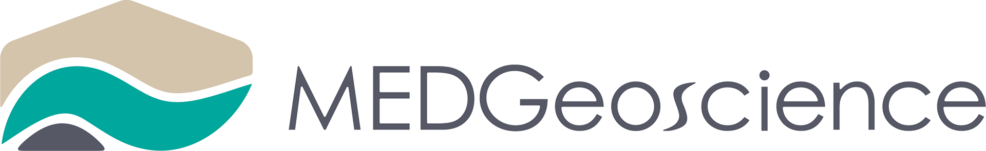
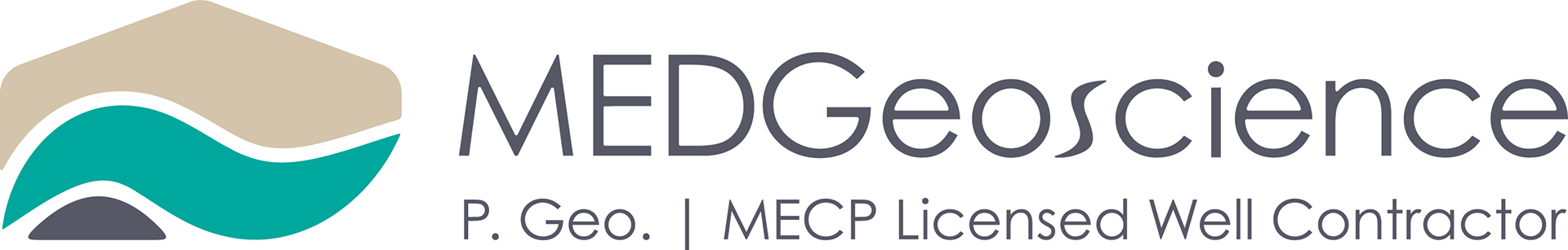
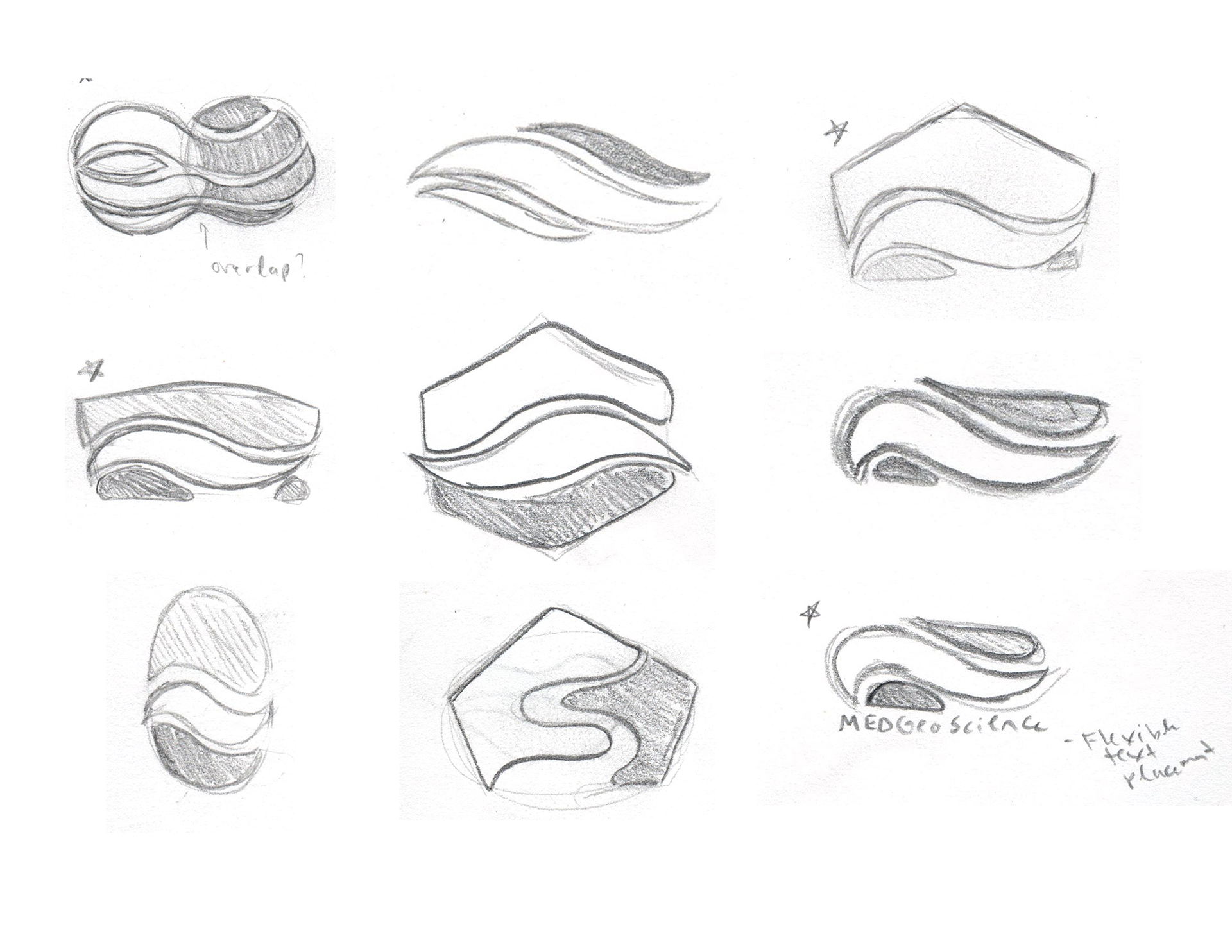
MEDGeoscience is a hydrogeological consulting firm. They were looking to develop a new logo for use on official documents, business cards, and eventually a website. We created a logo based on MEDGeoscience's connection to nature, that reflects brand values of trust, community-orientation, and relatability.
Deliverables
A flexible brand system consisting of a logo icon and word mark logo.
Challenge
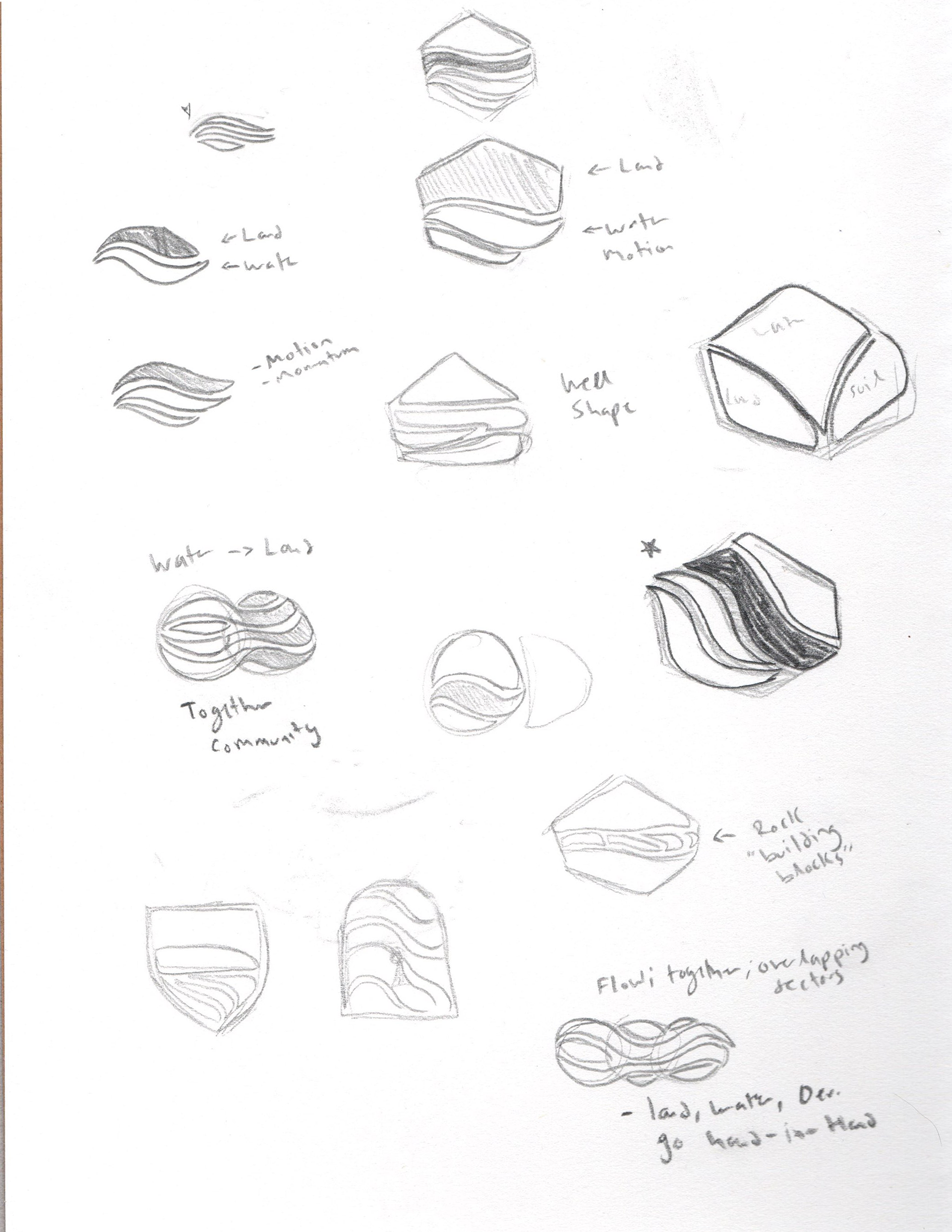
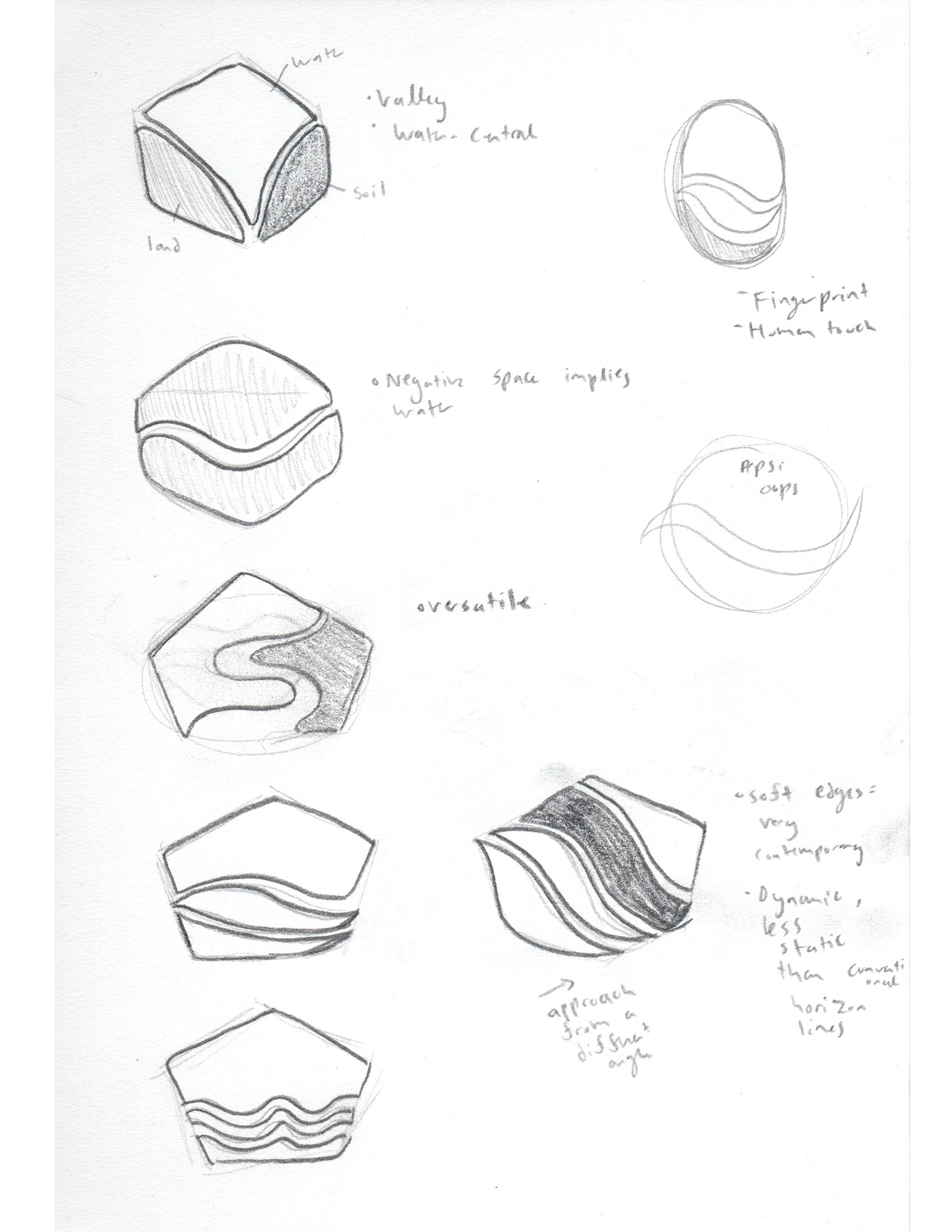
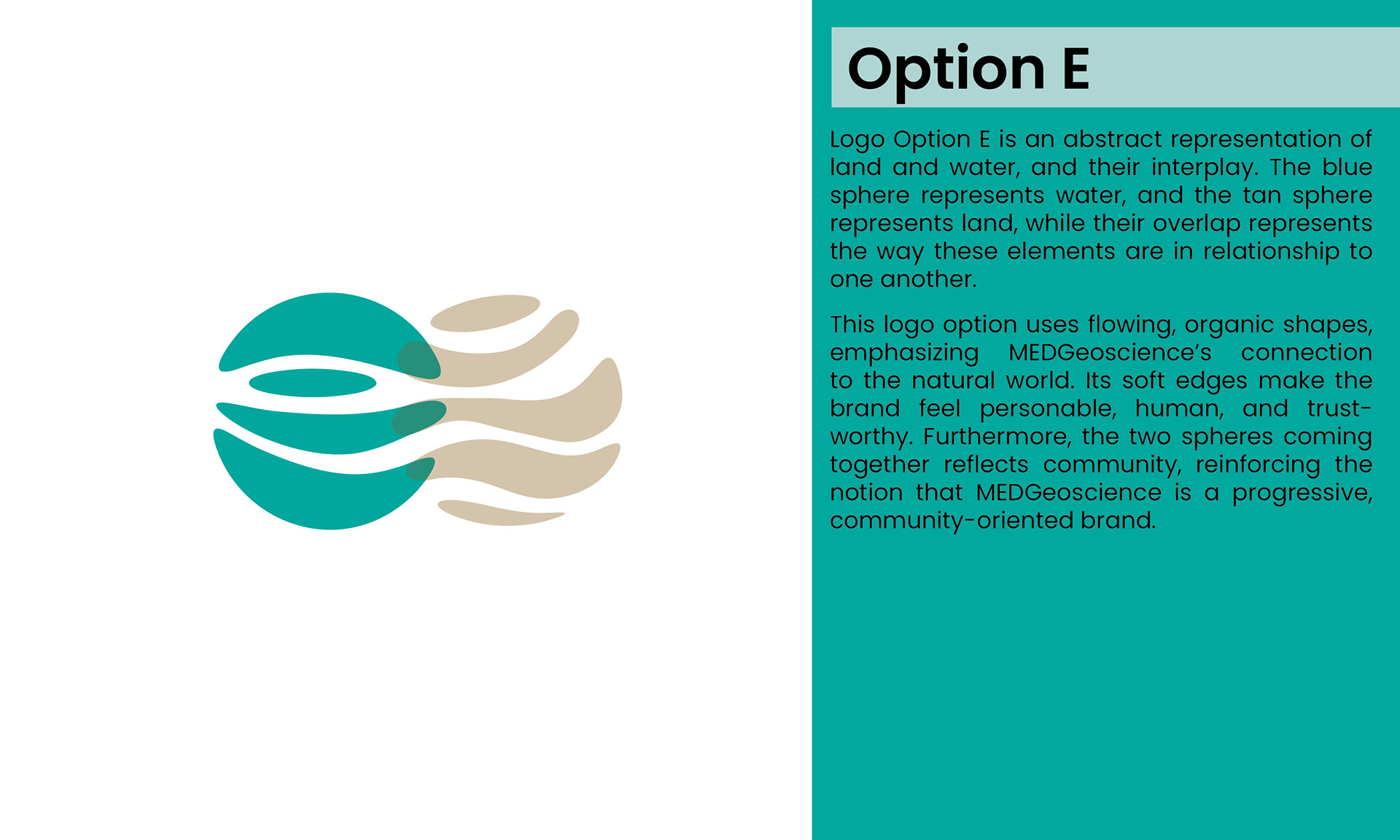
Represent the relationship between water and land in a minimalist, fresh way.
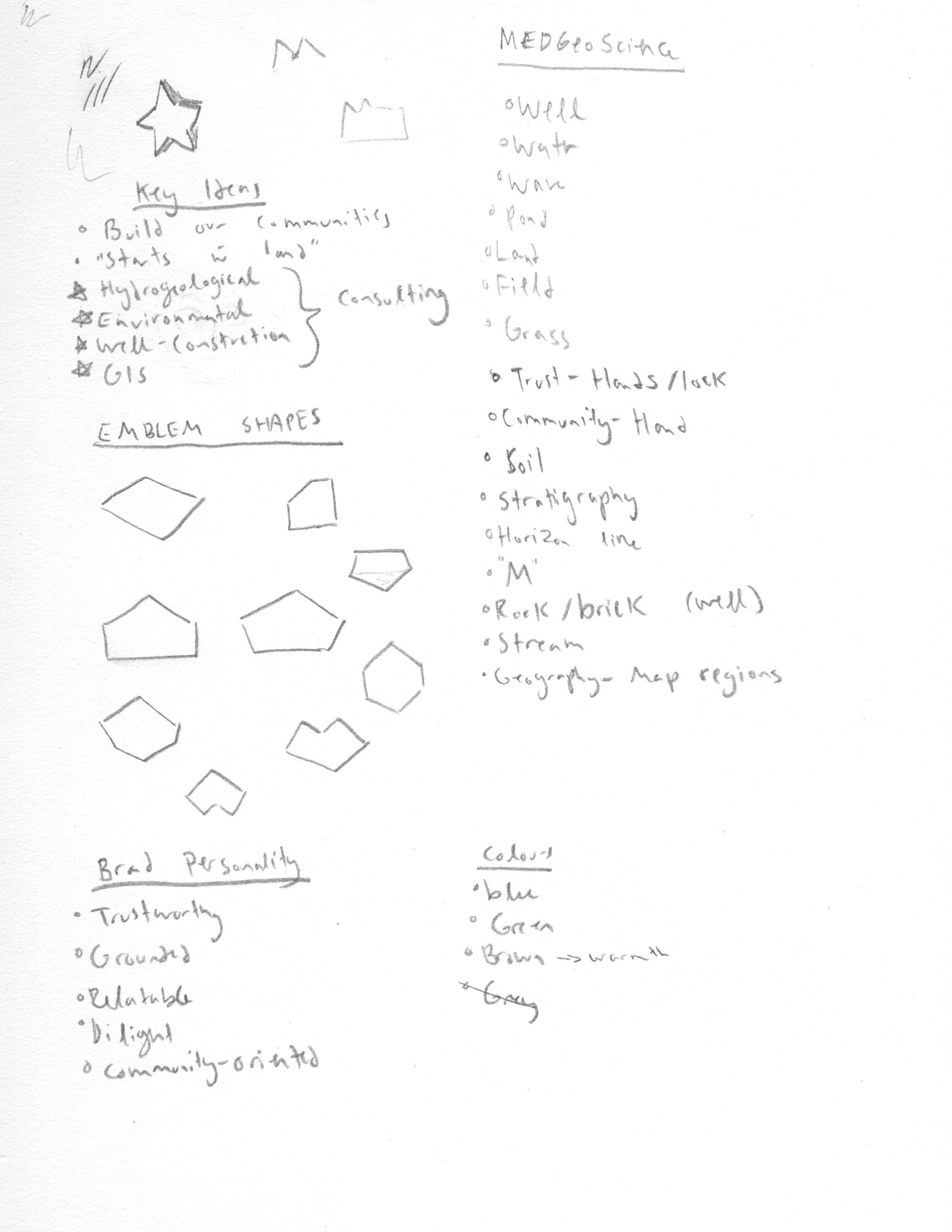
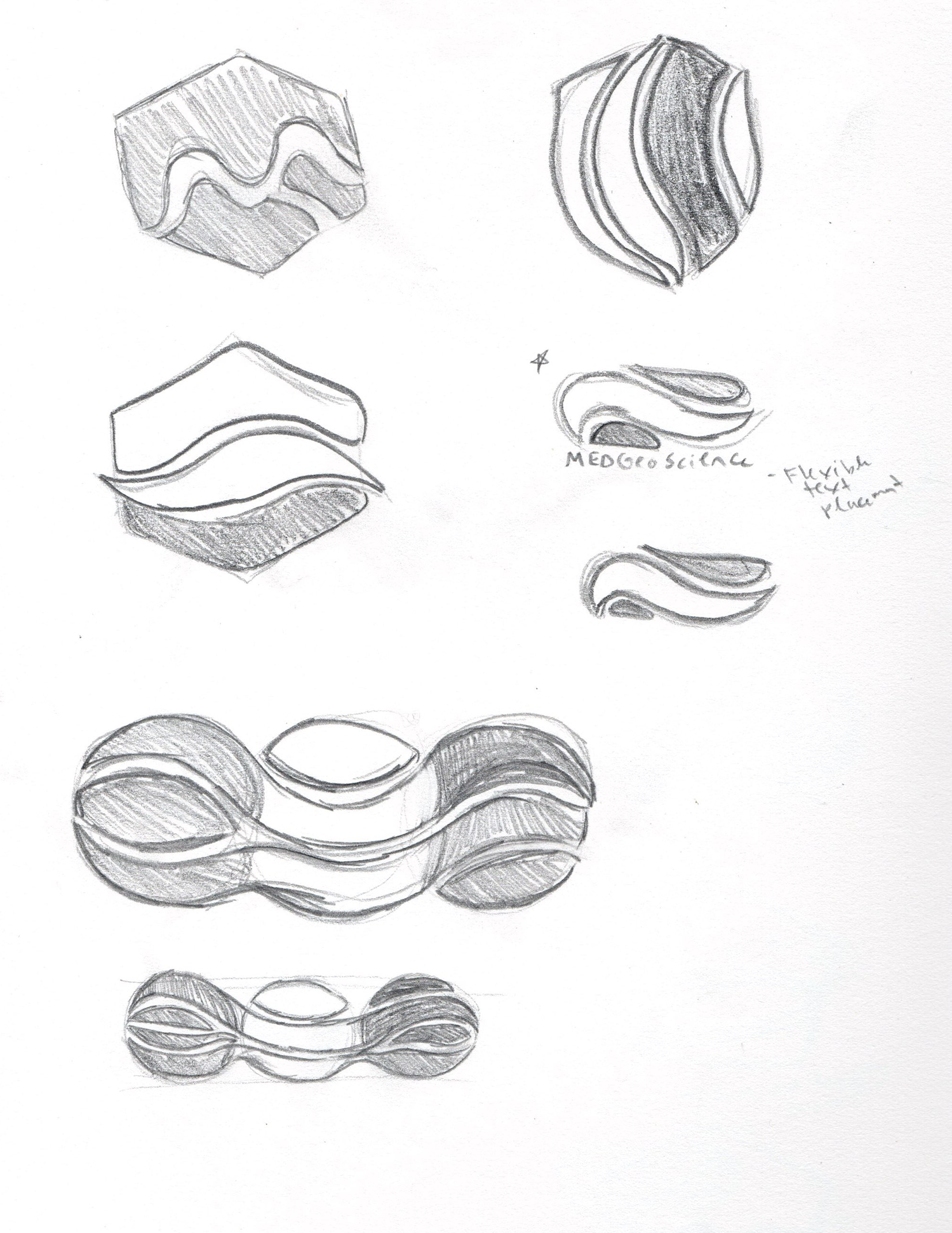
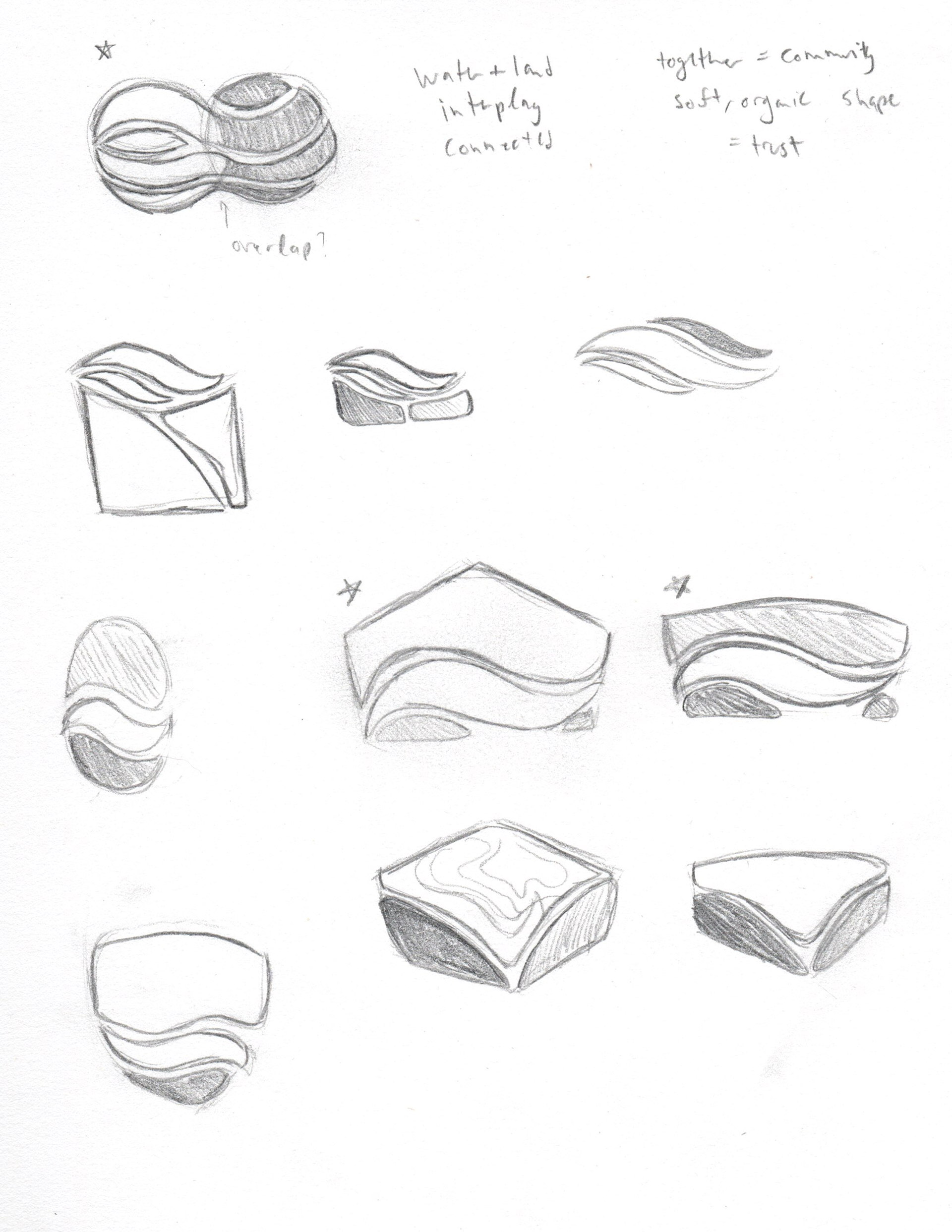
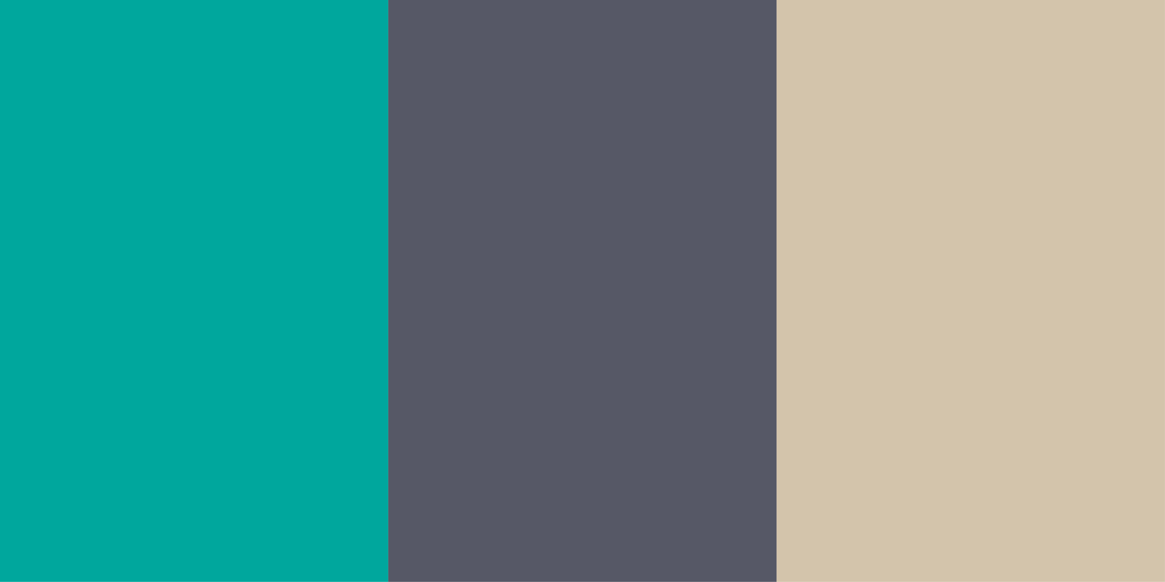
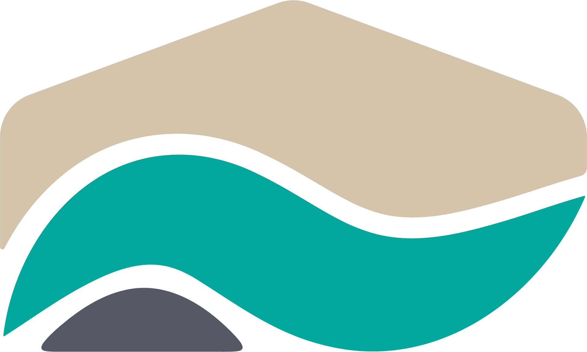
The MEDGeoscience colour pallet I developed consists of aqua blue, bedrock grey, and wheat.
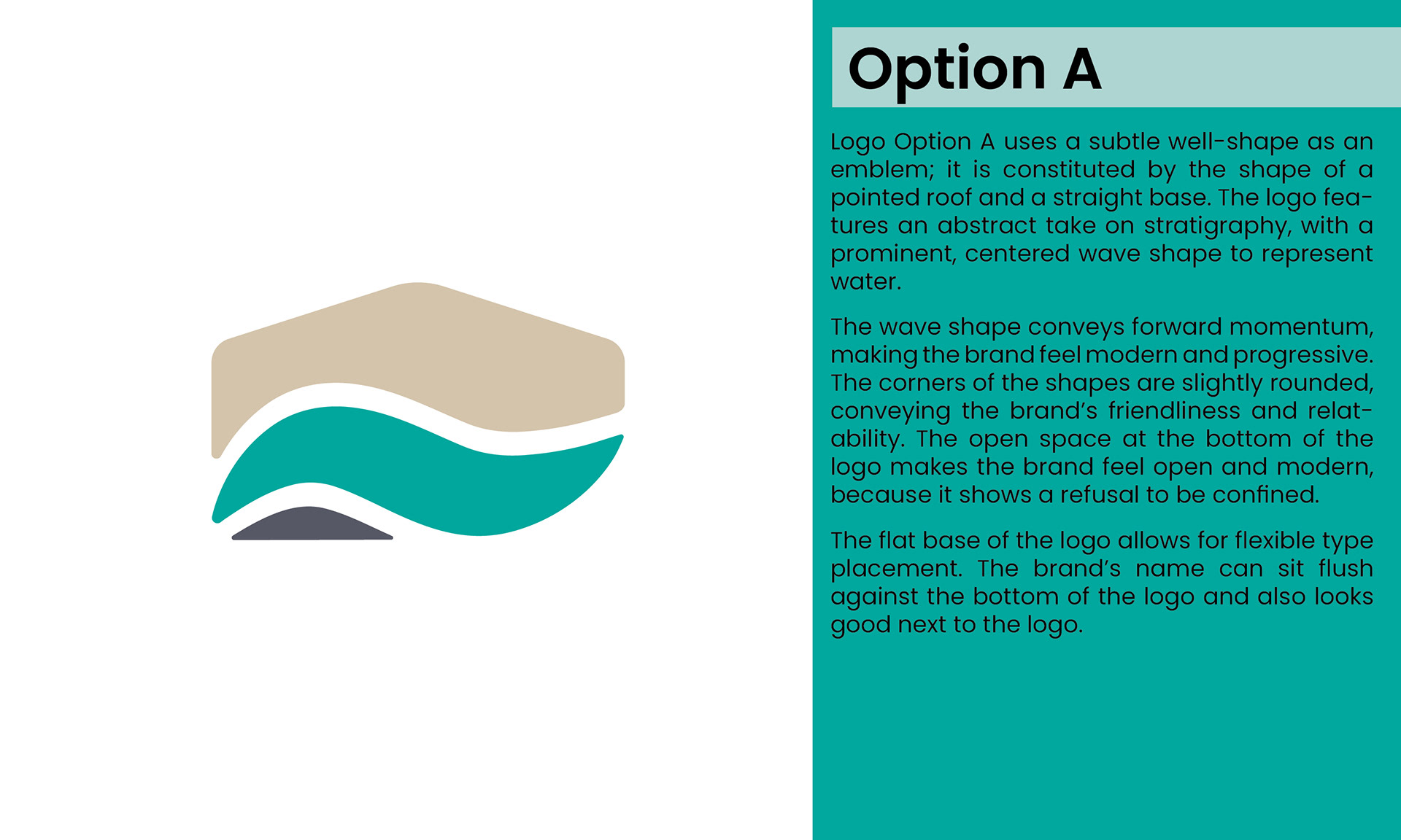
The client chose to develop logo Option A.